Quite an interesting question popped by Clemens Kofler on twitter: What retina devices are out there in the wild. (CSS pixel ratio >=1.5)?
Does anyone have an up-to-date list of Retina (CSS pixel ratio >= 1.5) devices lying around that they are willing to share? #lazyweb — Clemens Kofler (@clemensk), 4. März 2013
Well, as it happens I started to track retina display visits to my site back in October 2012. So I have some data I can share. The data is the salespage and my blog of my online hotel booking SaaS product: igumbi.com
Phones and iPads still rule

The majority of the visits are from iPhones and iPads, not surprising as they sport retina displays since the iPhone 4, and that dates back almost 3 years already. iPad joined the party since iPad 3 (was introduced back March 2012).

OSX retina display access, well that would be the expensive Macbooks - shipping since Q3/2012 - is steadily picking up. I also like the longer engagement on my site, but then again I have started some retina tweaks to appeal to those visitors;).
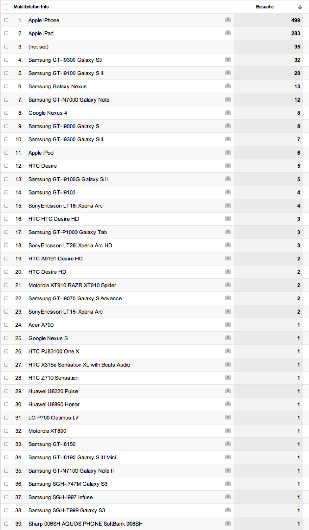
the mobile devices

No surprise, iPhone and iPad is at the top the list, but there is quite a diverse range of devices in Android land that sport CSS pixel ratio >=1.5
Tracking retina views is not so easy and can't be turned on in retrospective in your Analytics solution. You need to execute some javascript while the visitor is on your site. I opted to implement a custom analytics variable to do that back in October 2012.
Here is the code I use for tracking retina displays. This allows for setting up a "custom segment" in Google Analytics to pick up that variable and honing in on the target group.
<script type="text/javascript">
  var pixelRatio = (window.devicePixelRatio >= 1.5) ? "high" : "normal";

  var _gaq = _gaq || [];
  _gaq.push(['_setAccount', 'UA-1234567-01']);
....
  _gaq.push(['_setCustomVar', 3, 'PixelRatio', pixelRatio, 2 ]);

....

</script>
